|
In my updated critical reflection one i refer more to the work I’ve done. I quote things I said on my cover page and I refer to pictures I added showing that my goal is to add more diversity. I also bring up how me writing on Kanye could attract a whole new group of people into reading magazine which I did not mention in my first critical reflection. I wanted to refer back to my work so that the audience can have a better understanding on what I mean.
0 Comments
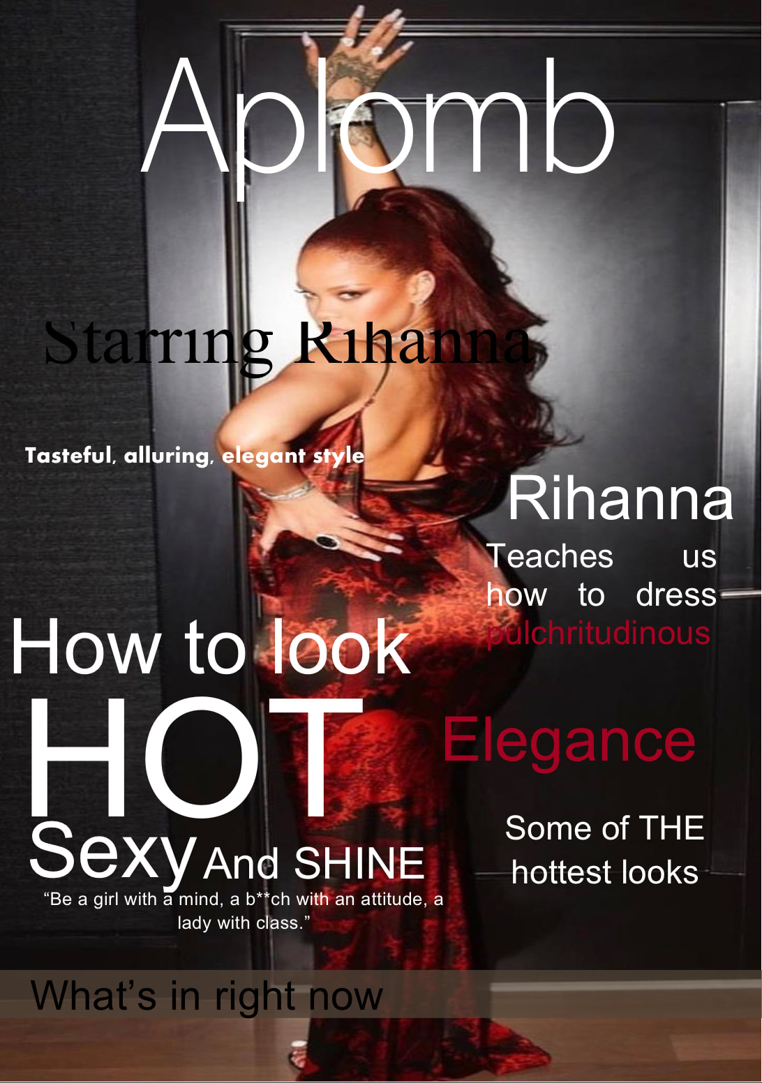
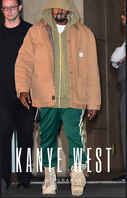
 I ended up putting a quote under Kanye west and I changed the titles color on the second page because it got lost in the background before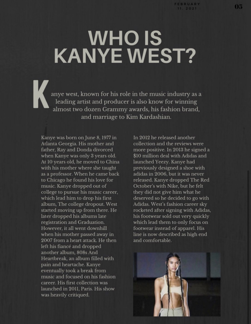 Both my TOC are pretty much the same, they are the same layout and I chose to keep it this layout because I like it. I changed the color scheme, I also put pictures of more well known models In my newer one. The reason I chose to do this is because my double page spread is on Kanye west so I felt as if my magazine should have more well known celebrities.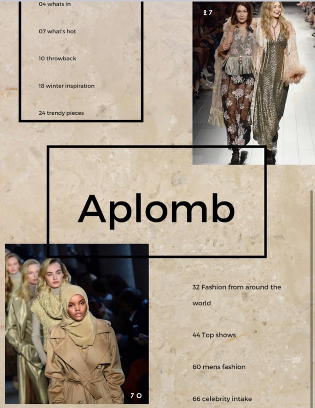 Photo credits https://images.app.goo.gl/eZ3C9qTxdTPYnnmd6 https://images.app.goo.gl/vE5sSjAQHSSJbV486 the first table of contents pictures were from off of canva 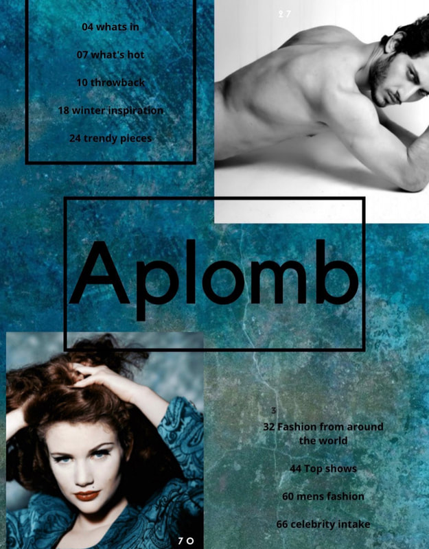 Continuing development of digital media technology is very significant to media institutions and audiences. Technology is constantly advancing, places need to keep up so they don’t lose their customers and audiences. They have to constantly make new products and better their old ones so that they continue making a profit. For example, phone companies like apple and Samsung are constantly coming out with new devices for their customers, if they didn’t they would eventually run out of business.
Critical question 1
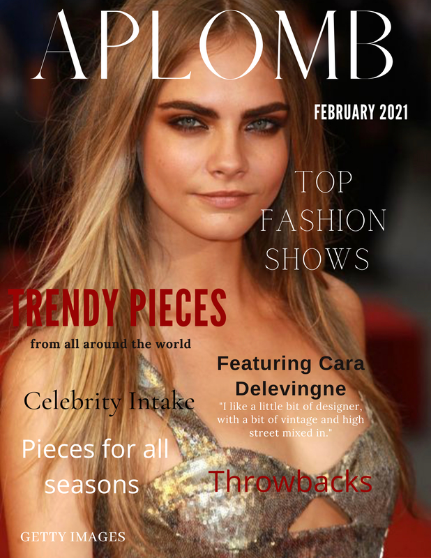
My magazine does not really challenge conventions so far. It’s mostly set up like any other fashion magazine cover. However, when I continue to add more to it later on I’m planning on adding a lot of culture and diversity from places around the world. It will challenge conventions because people will be looking at something they don’t usually see and clothing/people they’re most likely not used to. My magazine will represent many social groups and issues. This is because I’m doing fashion and there’s so much I can do when it comes to clothing and models. I want to represent many different people with many different backgrounds wearing ethnic and non ethnic clothing. I want to include models of all ages, backgrounds, etc. I want everyone to feel included in my magazine and I want most people to be able feel some sort of connection when looking at the models and clothing from their same background. My first magazine cover is not THAT different from my new one. It just looks a lot better because I used word the first time which was so difficult to work with, the picture is stretched and some words are cut off. I used canva this time and it was so much easier I actually enjoy making the magazine. I had used Rihanna before but I decided to use a picture of Cara Delevingne. The colors are pretty much the same, black, white, and a burgundy red ish. I didn’t mean to do that on purpose but it just worked out that way. I also wrote different things on the new magazine. I like my new magazine I feel like it looks like it could be a real magazine maybe?
photo credit https://www.marieclaire.com/celebrity/g2256/cara-delevingne-stunning-photos/
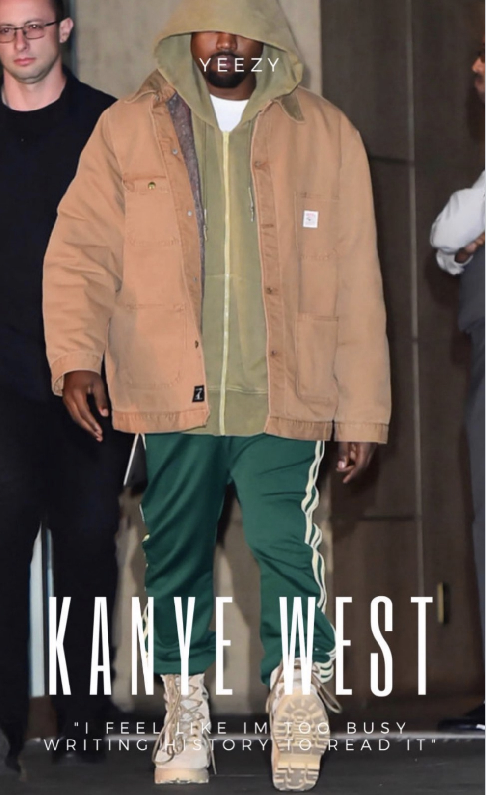
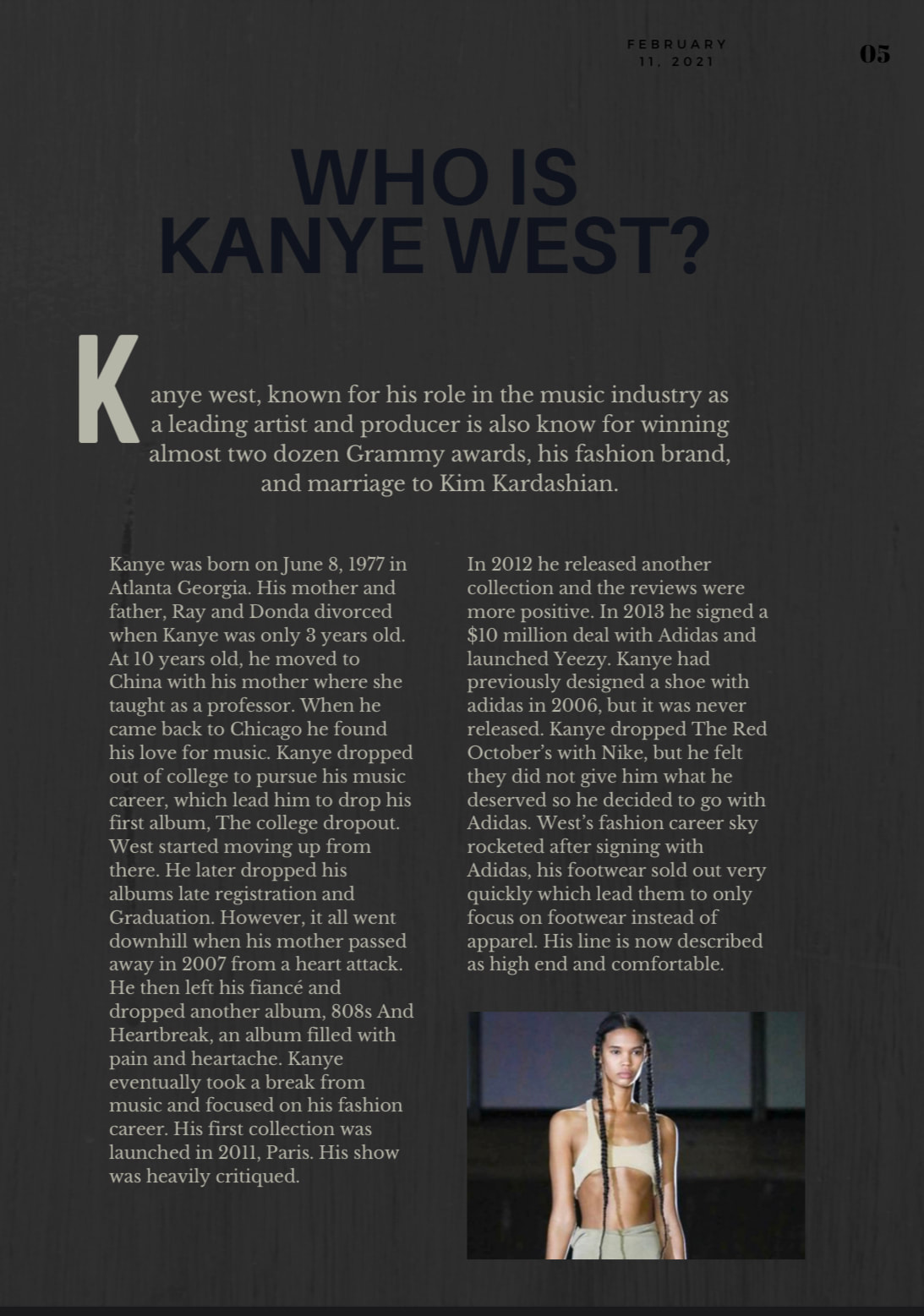
My double page spread vs the example double page spread are alike and different in many ways. To start off, the first page is a picture of James Lavelles face. My first page is a full picture of Kanye west. My first page also says Kanye west, biography is written under it and on top it says yeezy. The example only has little writing in the corner. The next page has a lot more differences. The example has James Lavelle written in really big bold letters whereas my page says “Who is Kanye west?” In smaller thinner letters. Both pages have an “intro” under the title. When the biography begins both pages also start off with a big first letter. The big letter in the example article is in a big red box, whereas mine is written normally. The article is separated through lines, mine is not. However I do like that I might make that change next time. My article has two columns of writing, whereas the other article has three. The other article also has a thin black border. The date and page number on the example article are on the bottom corner, whereas mine are on the top corner. The color scheme is also very different, the example uses red white and black. Mine uses different shades of grey, I struggled with the color scheme because I was not sure what would go well with the first page, I think I could have done better on the colors. My article also has another small picture under the writing.
https://cpb-eu-w2.wpmucdn.com/blogs.grammar.sch.gg/dist/e/5/files/2018/01/Bio-29g1s94.pdf My magazine does not really challenge conventions so far. It’s mostly set up like any other fashion magazine cover. However, when I continue to add more to it later on I’m planning on adding a lot of culture and diversity from places around the world. It will challenge conventions because people will be looking at something they don’t usually see and clothing/people they’re most likely not used to.
My magazine will represent many social groups and issues. This is because I’m doing fashion and there’s so much I can do when it comes to clothing and models. I want to represent many different people with many different backgrounds wearing ethnic and non ethnic clothing. I want to include models of all ages, backgrounds, etc. I want everyone to feel included in my magazine and I want most people to be able feel some sort of connection when looking at the models and clothing from their same background. 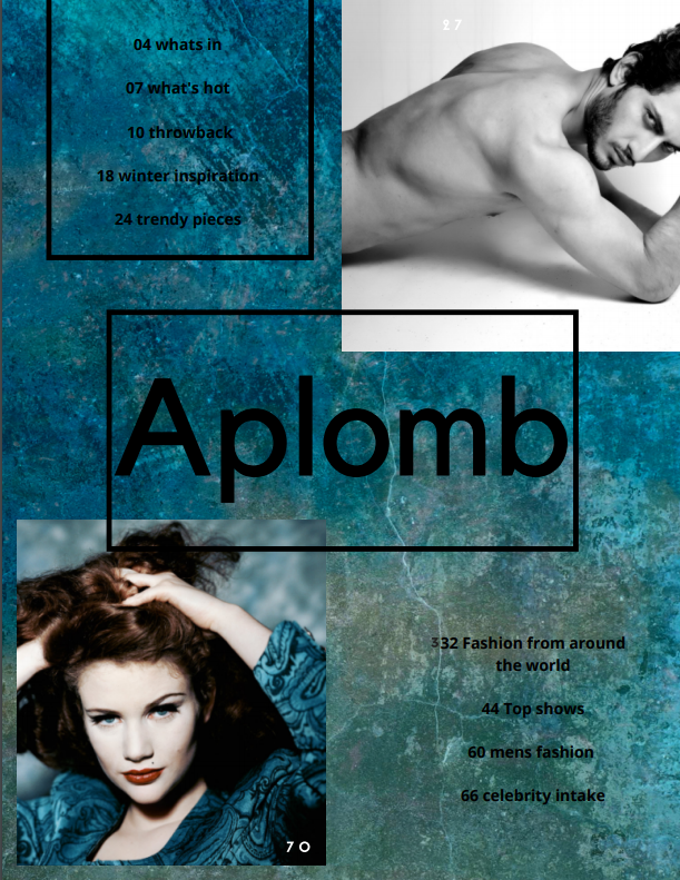 Honestly my product does not really challenge conventions. I think I did good, however it is pretty basic, which is what I was going for. Only thing I would say that may be different is the background. My table of contents doesn’t really represent social groups or issues other than maybe people that are interested in clothing.
My product engages with people of all ages and genders because clothing and fashion has no boundaries. I think my magazine cover appeals to my audience because it is so obvious it’s about fashion. A lot of people also look through clothing magazines for inspiration or when they’re bored so I feel as if it probably will attract many people. I’m not sure if my magazine will be on paper or digital yet but so far I’m leaning towards digital. |
AuthorWrite something about yourself. No need to be fancy, just an overview. Archives
February 2021
Categories |
 RSS Feed
