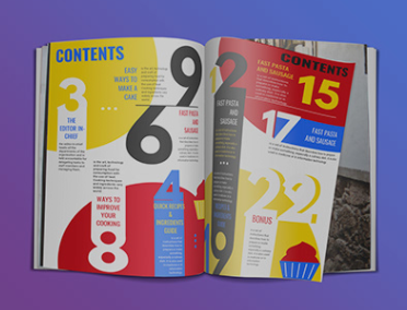
 I like this table of contents because although it seems like there is a lot going on, the big numbers make it easy for people to read it. I like how its colorful and eye-catching and I even like how the numbers are out of order because personally, that draws my attention. As of right now, this TOC does not match my cover very well because although I like it, my cover is a bit simpler. Possible article topics could be fashion, children's magazines, fitness, politics, etc. 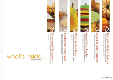 I really like this TOC because instead of just stating that this is the table of contents, it says "what's inside..." which I personally like. I also really like how the pictures show us a glimpse of the inside of the magazine. This would match my magazine if the pictures were changed obviously. Its very organized and easy to read and I would definitely use something like this for my magazine. possible article topics could be cooking, crafts, travel, business, etc. 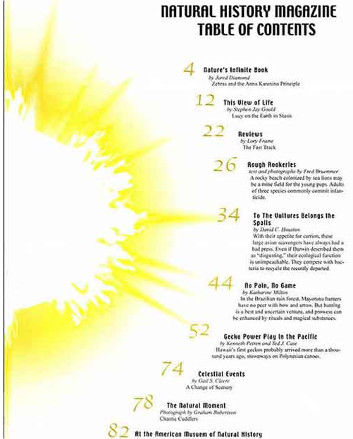 I chose this TOC because I like how the sun is the big picture and the numbers and subtitles surround it. Its nice and simple which makes it pretty look at. This wouldn't really match my magazine because this is more for nature and none of my magazines were about nature. possible article topics could be nature, health, lifestyle, parenting, etc.
0 Comments
Notes:
My notes and the candidate's notes were similar, but also very different because the candidate was a lot more detailed than I was. Camera- I wrote down the camera zoomed in on the washing machine and hammer and showed both peoples face while they were arguing, while also going back and forth between both. The candidate put several things such as, change of focus in the first setting, high angle and slight tilt as she comes down the stairs, zoom in onto washing machine, reverse shot during wife and husband talk, zooms in on main character, and close ups further on into the conversation. Sound- For sound both me and the candidate put, clattering of the washing machine and background soundtrack and the phone ringing. I also included the loud noise of the hammer to the head. The candidate included the wife's speech is dominated by washing machine during main characters thinking period, and dialogue and background noises. Editing- The candidate and I both wrote down the fading/transition of the scenes. The candidate added things like pace is slow and superimposition helps establish the setting the main character is living in. Mise-en-scene- Both the candidate and I wrote there was dim/low lighting throughout and dark furniture. I included there was little spotlight shown on the washing machine. The candidate included tones of grey and blue of the setting, highlights on the face, and characters have dull colored clothing. Write up: Similarities- We both started our write up by explaining the dull and gloomy setting, we also both included the washing machine being a bit brighter than the rest of the setting. We talked about the camera shot being close to the actors faces to show emotion and facial expressions. Differences: some things the candidate wrote about that I didn’t were, the light highlights on the actor's face, their appearances, the camera shots (medium and long), the main characters misplacement into society, the cold atmosphere, etc. Some things I talked about that the candidate did not were, how something made the woman upset in the beginning, the woman being passive aggressive and the man being anxious, the way she treats him, their failed marriage, what may have been going on in Lester's head, the poster being a sign, the soundtrack, how he may be trying to set someone up, etc.
Title- I chose the title Aplomb. Aplomb means to have a complete and confident composure. I think this title is fitting because my magazine is based around fashion and models or people who dress well in general are very eye catching when they are confident or aplomb.
Typography/ language- I made the title white, font is Abadi extra light, and the size is 130. The font is very simple, but the title is in big letters, so it is still eye-catching. the strapline says “starring Rihanna” because that is the model shown on the cover. I mentioned Rihanna twice because she is the model in the picture and I used words like elegant, hot, alluring, etc. because I am trying to portray beauty. I used the color white a lot because the background is dark. I only made a couple words burgundy to compliment the dress she’s wearing. Image- the woman in my cover is Rihanna. She is a famous singer, actor, and businesswoman. The picture is taken at eyelevel. Her back is facing the camera and her head is turned around. She is showing the back of her dress. Her dress is long and silky, its black with a burgundy pattern on top. A little more than half of her face is shown because she is turned around. Intertextuality is the way in which one media text references another or the concept of borrowing from, modifying, and recycling other media texts to create a new media text The different types of intertextuality are: obligatory- an important reference is made, therefore if the audience does not comprehend the credit they will not fully understand the text in hand optional- relationship to prior text exists but is not essential accidental- relies on the audience to make connections that were not intended by the author There's a south park episode where they include mickey mouse and the Jonas brothers In wreck it ralph 2 there is a scene where all Disney princesses are shown Family guy mimicked the cover for the movie "Return of the Jedi"
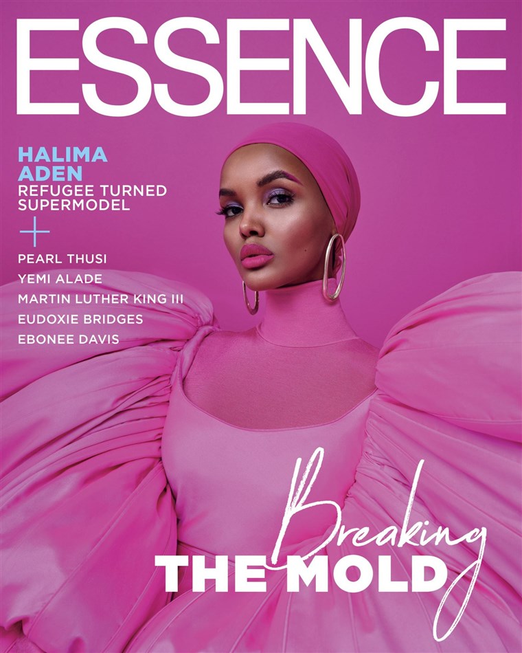
The visual elements I see is the model looks very sophisticated and modest. It looks like she is standing straight and looking at the camera with her face slightly tilted for a more elegant look. She is wearing a pink lowcut dress with very puffy shoulders, she is also wearing a pink turtleneck under it and a pink hijab to cover up because she is Muslim. The color scheme is obviously pink, the background, her makeup, and her outfit are all pink, however her hoop earrings are gold.
The linguistic elements I see is at the top of the magazine it says "Essence" in big letters, then under that it has the models name and at the very bottom of the cover it says "breaking the mold", "breaking" is in cursive and "the mold" is in bold letters. I feel like the lifestyle suggested is maybe a more hardworking lifestyle, probably showing that anything is possible because it says on the cover, "refugee turned supermodel" Representation wise, Halima is the only person shown on the magazine cover, however on the side of the magazine a couple names were listed such as Pearl Thusi, Martin Luther King, Yemi Alade, Eudoxie Bridges, and Ebonee Davis. Something all these people have in common is they are all black activists. For mode of address I feel as if the audience being addressed is people of color, or minorities/diverse people. A person reading this magazine can see themselves as an addressee if they are a person of color, Muslim, or a refugee. They will probably also feel very inspired by this magazine cover. A potential reader is being persuaded to work harder to get what they want, this is because they are showing a supermodel who was a refugee. It's inspiring and will probably persuade some people to follow their dreams. |
AuthorWrite something about yourself. No need to be fancy, just an overview. Archives
February 2021
Categories |
||||
 RSS Feed
